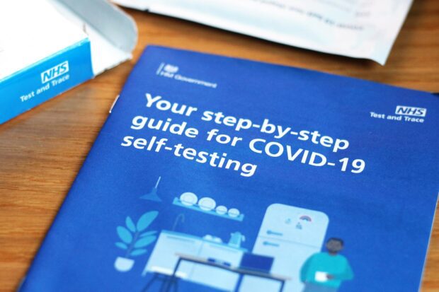
The public have used more than 180 million rapid lateral flow tests in the UK since they were offered for free in April 2021. Every test kit has printed instructions for use (IFU) so people testing themselves or others at home can easily understand what they need to do.
The instructions for use have been held up to a very harsh light – every word matters because all users across the UK must be able to understand and act on the information.
But it’s not just words. The content design team is part of a multi-disciplinary team that developed the instructions and continues to improve them.
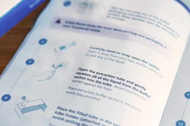
Using images to help users
We work very closely with the visual design team to make sure images complement text and help users follow the instructions.
Images must be easily understood by all users. Testing users with different accessibility needs found that “imagery of the test was appreciated and matched participants’ desires to check the test kit components on opening.”
Andrew Beswick, lead visual design manager, makes sure all images in the IFU are simple, effective and leave no room for confusion. Andrew says:
My approach is to be as human-centred as possible – it’s all about the words working together with the design and icons.
We aim for a simple clarity, function and aesthetic in all our visual design and icon usage, working towards a straightforward solution that can work well with the content text.
The images in the instructions are made to work for everyone, whatever their language or readability levels.
Using video to help users
A video, properly subtitled, hosted by a trusted doctor takes users through the steps they need to successfully complete a rapid lateral flow test. Because no matter how clear your content and images are, when there are millions of users with different literacy levels and accessibility needs, some will find a video easier to follow.
The user testing team worked with cognitively impaired groups, finding that some participants found video clearer and more preferable to text instructions.
We worked with the NHS brand and content team to write the video script. Abi Silvester, Lead Brand and Content Manager, explains:
Self-testing essentially requires people to learn a new skill very quickly, and we know that people have very different learning styles and preferences. It was important to provide a full end-to-end demonstration of the testing process alongside the physical instructions for use, featuring the exact kit that users receive.
When scripting the video, we had to tread a careful line between ensuring the delivery was relatable and could flow naturally, while maintaining clinical accuracy at all times.
We also needed to consider ways to future-proof the content, knowing that policy could change at any time. This included working closely with the content team to ensure links (including those printed in the instructions) would not break when we needed to make updates to the videos.
Keeping content consistent
Up until July 2021, everyone used the same type of rapid lateral flow test. There are now 4 types of rapid lateral flow tests available.
The content and visual design teams worked with clinical and policy colleagues in government and the NHS to create an instructions template.
Every manufacturer applying to distribute a rapid lateral flow test in the UK must use this template. It means that every instruction uses the same images and we only need to tweak the content to support changes in the testing procedure.
This means that the millions of people who’ve used a rapid lateral flow test in the UK can follow the instructions in a different type of test as easily as they did before.
Content design isn’t a silo
Creating clear instructions for users with content design working in an agile, multi-disciplinary environment has economic benefits. As Abi Silvester points out:
We have developed a system that allows us to modify an earlier ‘core’ video in-house, without having to shoot new footage. This helped to reduce production costs considerably and allowed us to publish new videos more quickly when new tests were deployed.
Content design must be an integral part of any project from the beginning. By working with policy, comms, user testing and visual design colleagues, we can iterate quickly and accurately, giving users instructions they can understand, trust and act on.

2 comments
Comment by Kenny posted on
Great insight into the process there. I was wondering what decisions had been made around some of the terminology used - for example Extraction Buffer Tube may not be a thing most people are immediately familiar with.
Interestingly despite the clarity of the instructions I have only just now realised that the Icon Flowflex test should be performed using a nose sample only!! If it wasn't for this article I would have never revisited the instructions and continued stuffing it down my throat.
It could be just me, but should that kind of information be made more prominent on the packaging rather than giving space to branding and contents?
Comment by Ben Clancy posted on
Hi Kenny
We must use certain terms to pass regulatory and clinical approvals, which is one reason why the images are so important.
The Flowflex guide does say it's nose only, but not clearly enough. We've done more user testing to understand what calls to action, and where to put them, will make the nose-only instruction clearer and more obvious to users.
We'll improve the instructions based on the user testing findings.
Ben