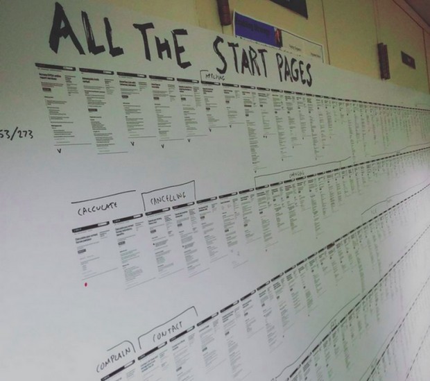
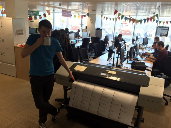
On Wednesday we printed all the start pages on GOV.UK onto a big sheet of paper so we could get a better look at them. It turned out to be really useful, so I thought I’d write about why and how we did it.

Why we did it
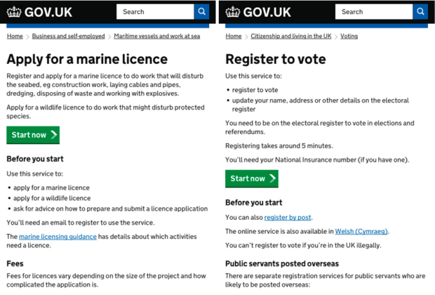
Start pages are the pages that connect transactions on GOV.UK to the rest of the site. They’re the pages you find if you Google ‘Apply for a marine licence’ or ‘Register to Vote’.
Start pages have a lot of work to do. They need to quickly and easily describe the transaction, who can use it and what’s involved. They also need a nice clear call to action for people who just want to get started.

We don’t always get it right so we wanted to look at all of our start pages and see if we could spot any good or bad content patterns. Printing them all out let us do this really easily.
The results were detailed enough that Rebecca and I could read all the words, but we could also step back and see all 273 pages at once. We could see at a glance which pages were too long, which ones had the action button too far down and which ones had been badly named.
They were ordered alphabetically by page title, which meant pages with the same starting verb (‘Apply…’, ‘Find…’, ‘Cancel…’ etc.) were clustered together. We’d not planned for this, but it gave us a lot of insight into the kinds of transactions we have and how we talk about them.
Also, big things on walls are a discussion magnet. We had people stop by all day to take a look, and uncovered more than one related piece of work happening elsewhere in GDS.
So that’s why we did it. If you want to do it too, read on.
How we did it
1. Get the URLS of the pages
Luckily, because of the way our publishing platform works, Kush had pretty much generated the list of URLs before I’d finished asking him for it.
2. Generate the screenshots
We fed the list into the free Paparazzi! screen capture software. It spat out all the screenshots into a folder.
3. Crop the footers
GOV.UK has a big, grey footer. You don’t need to see this 273 times. It would have wasted loads of ink too.
Rather than wrestle with Photoshop we used the command-line based ImageMagick to crop off the last 930px of each image. ImageMagick is really good at this sort of stuff. This is the command we used:
mogrify -crop +0-930 +repage *.png
4. Stitch all the images together
We also used ImageMagick’s ‘montage’ command to make a new image with all the pages on it, like this:
montage *.png -geometry +40+40 -tile x6 -gravity North montage.png
That’s basically saying: “Take all the PNGs in this folder and make a 6 row, top-aligned montage of them, with 40px margins round each image”.
5. Print it out
This was the hardest part. The final image was about 40MB and we struggled to get the plotter to accept it. In the end we halved the dimensions and converted it to grayscale to get the file size down.
If you don’t have a plotter then ImageMagick will happily generate a series of A3-sized images instead.

What's next
We'd like to run some analytics on the pages and then re-order the images. For example, if we order them by the proportion of users who click on the action button we think we might learn something about what makes an effective start page.
Tim Paul

6 comments
Comment by Andrew Robertson posted on
Does every online service need a 'start' page on GOV.UK, or would a detailed guide with a link sometimes replace the need for a start page?
Comment by Tim Paul posted on
Hi Andrew. Yes, every service needs a start page. There have been a few instances in the past of transactions being linked to from within guides, but we don't think this is the best solution. One of the things we'll be looking into is how start pages can better support the need for combining services with information.
Comment by Simon Hurst posted on
One of the issues we're starting to see with the 'services as a verb' rule is when a screenreader user is looking on gov.uk for the service they want. List links ends up being a big long list of 'apply, apply, apply' which is really frustrating for a user.
Any thoughts on this?
Comment by Tim Paul posted on
Hi Simon. I think there are trade-off's either way but the verb format is more likely to be closer to what the user wants to do, because it explicitly contains an action. What circumstances result in users facing a long list of services on GOV.UK? I'd hope that our search and browse features were stopping that from happening too much.
Comment by Hai posted on
Don't fully grasp the advantages of a separate service start page, instead of linking to the service from a quick answer or a guide (or several...). Could you elaborate on the advantages? Focusing on the user need and journey (I can understand if it's better in regards of tracking etc).
Cheers,
Comment by Tim Paul posted on
Thanks for your comment. Ultimately, users should be able to find services in whatever way suits them. Some may need to read guidance first or use a quick answer, some will arrive straight from Google or an external link. Having start pages also makes it easier for us to track and index services as you said. If they're done well they shouldn't feel like an 'extra' page, but we recognise that that's not always the case.