Over the last couple of sprints on mainstream, Amy and I have been looking into transaction start pages to try to get a handle on the direction we need to take them in.
We thought it’d be useful to share some of our discoveries and subsequent thinking.
What is a 'start page'?
A start page is:
- the quotable (canonical) url a user goes to to start a transaction
- hosted on GOV.UK for indexing and SEO
Transaction variables
Our first step was to try to get an idea of the kind of things that are currently displayed on start pages and other things that should be considered.
We did this by looking across a variety of transactions and speaking to different teams. Here's the growing list of variables that we collated:
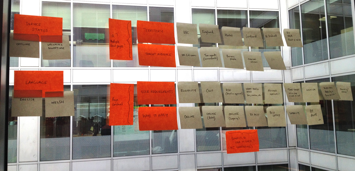
- Territory
- UK
- England
- Wales
- Scotland
- Northern Ireland
- EU, EEA
- Rest of World
- Audience
- UK citizens
- Tax agents (accountants)
- Business people
- etc..
- User requirements/considerations
- Eligibility
- Cost
- Risk
- Physical documents needed, required numbers etc.
- Time taken
- Login
- Progress / stage
- Deadlines
- Assisted digital, alternatives
- Ways to apply
- Online
- Online (beta)
- Online (legacy)
- By post
- At the post office
- Embassy
- By phone
- Language
- English
- Welsh (in a tiny minority of cases)
- Transaction status
- Offline
- Upcoming downtime
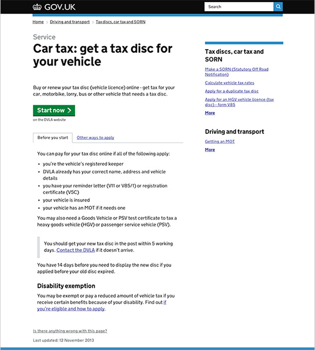
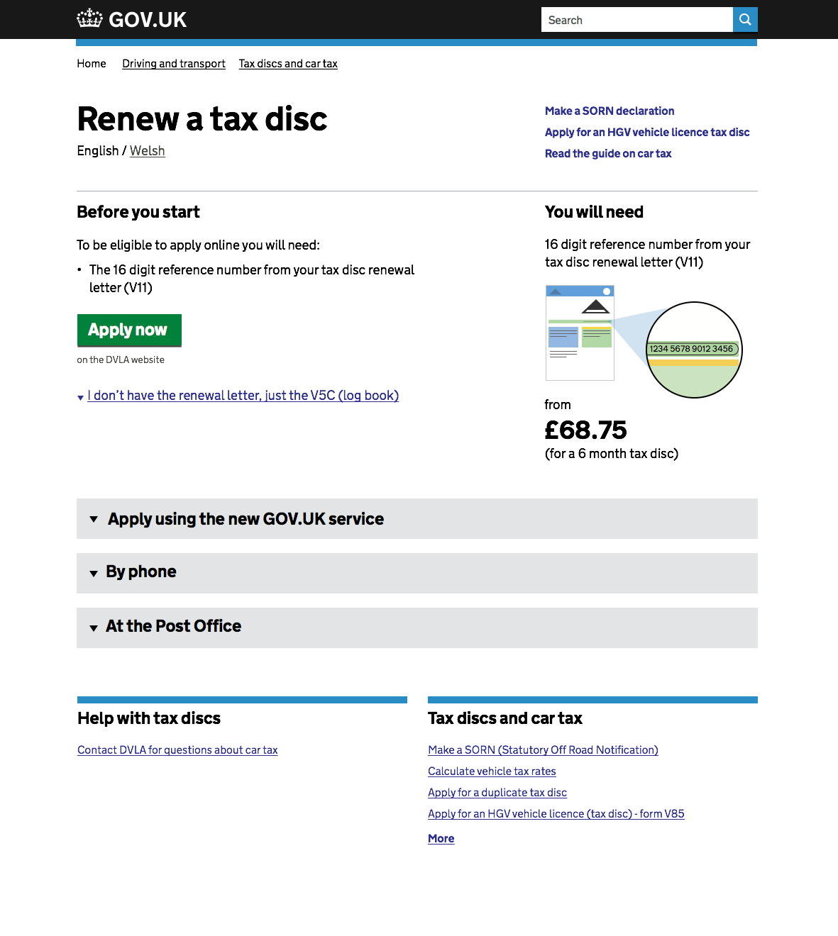
Example transaction
We then chose an example transaction to work with.
Based on user numbers, we settled on the DVLA, renew a car tax disc as it has the highest volume of traffic of a transaction that is currently being redesigned and not far from releasing.
This is how that transaction’s start page currently looks.
Rethink
Based on the variables we'd outlined, we spent a lot of time sketching. We met with designers and user researchers from other transactions and discussed start pages quite widely as a theme.
We also spent a lot of time interrogating the renew a tax disc service and John Byrne helped us source analytics data showing its use.
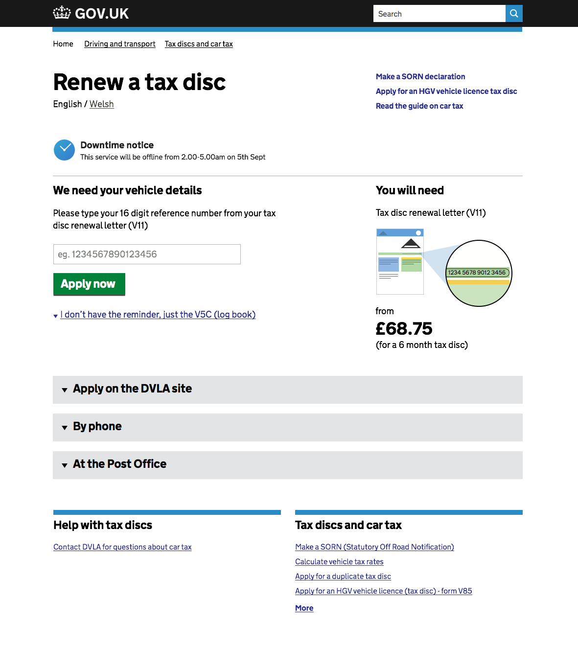
Our conversations/sketches led ultimately to this layout:
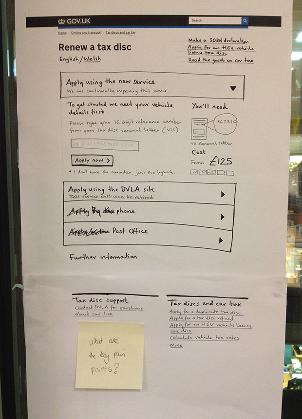
The thinking behind this sketch at glance is:
- Content is broken up based the different method of applying
- The bare minimum eligibility criterion is the 16 digit number, so this is what we use.
- We favour self certifying eligibility by entering the 16 digit number rather than just showing that the user will need it.
- We never use the word Beta. (we don't believe real people understand this)
- While we present optional methods of applying, we confidently lead with one option. Presenting users with an equally weighted choice feels weird.
- Related links (in this case) are relegated based on negligible use (<0.2% of users)
- The service has a support/help section at the bottom. If a user is at the bottom, they may need help.
- Documents presented visually.
We then worked these sketches up. Still rough though and without decent copy editing...
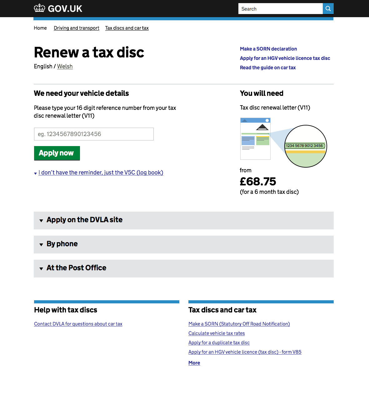
Beta first, legacy second
Legacy first, beta second

By phone revealed
Outcomes and reckons
- One-size-fits-all start pages will not work
- We should surface the 3-4 main eligibility criteria only (it is the job of the transaction to deal with eligibility)
- Favour interactive eligibility over lists of eligibility criteria where and when we can
- WTF is Beta?! Users don't understand this language, we should talk in plain terms. New service is our current term.
- We will need to work with exemplars/transaction teams to make bespoke start pages
- Start pages are the canonical URL not format. ie. not all start pages must look exactly the same. It depends on the user needs/audience.
For anyone that's interested, a lot of this stuff is on the window by Steve Laing's desk in the mainstream team on 6th floor.
Next steps
We're now going to look into four or five more diverse transactions from a mix of departments to explore and test our thinking. We want to see if patterns emerge.
The current list (subject to change) is:
- Renew a tax disc (DVLA)
- Change your company car (HMRC)
- Student finance (SLC)
- Carer's allowance (DWP)
- Prison visits booking service (MOJ)
We're planning to meet with designers/researchers from those teams and get sketches in front of users in their testing sessions.
We also have Jon Sanger helping us with copy to add some rigour to content design.
No doubt, there will be new findings which will change and adapt our model. More on that soon...

2 comments
Comment by Stephen Gill posted on
Interesting. Are start pages for licences in scope for this piece of work?
Suspect user expectations may be slightly different than for other types of service - ie do users see the licence itself as a "thing", and therefore expect to apply/update/renew information on the same page?
Comment by Guy Moorhouse posted on
Hi Stephen,
Thanks for the comment and sorry about the slow reply.
We're not currently looking at licences as part of this piece of discovery work. That said, I'm sure we'll tackle it in time and bear in mind our findings here when we do.
One-size-fits-all is definitely not the way to go with this stuff. As and when we do have another look at licences, we'll do further research and testing to get a handle on the best approach.